
Choosing any color scheme — whether for graphics, websites, brands, etc. — is a challenge in and of itself. That choice of colors sets the mood for anything and everything you create.
When it comes to data visualization, color is especially important. The color scheme sets the tone of the imagery and each color serves to represent a unique piece of information.
The colors you use in your data visualizations represent more than just one idea. The color scheme you choose has the power to display the type of data you’re showing, its relationship, the differences between categories, and more.
This post will take you through the process of choosing the perfect color combination for your next data visualization — from understanding your data to finding the right color tool.
How to Pick the Perfect Color Combination for Your Data Visualization
Is Your Data Sequential or Qualitative?
The first step when choosing a color scheme for your data visualization is understanding the data that you’re working with. There are three main categories that matter when choosing color schemes for data: sequential, diverging, and qualitative color schemes.
Sequential color schemes are those schemes that are used to organize quantitative data from high to low using a gradient effect. With quantitative data, you typically want to show a progression rather than a contrast. Using a gradient-based color scheme allows you to show this progression without causing any confusion.
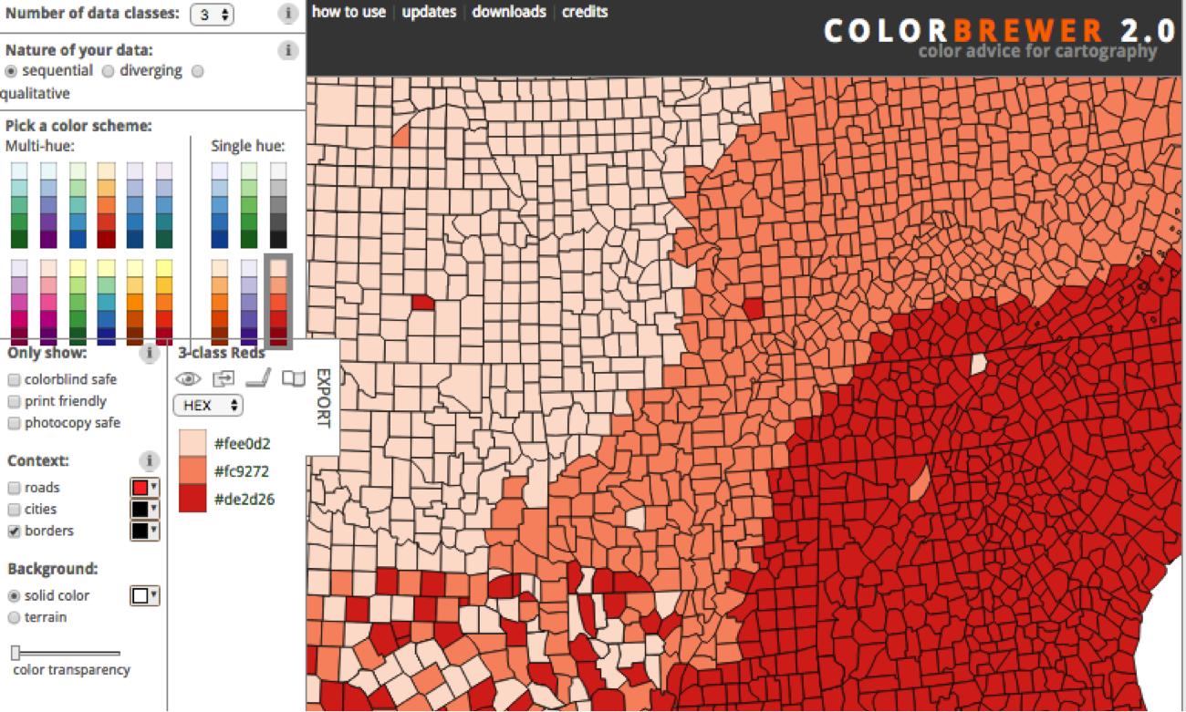
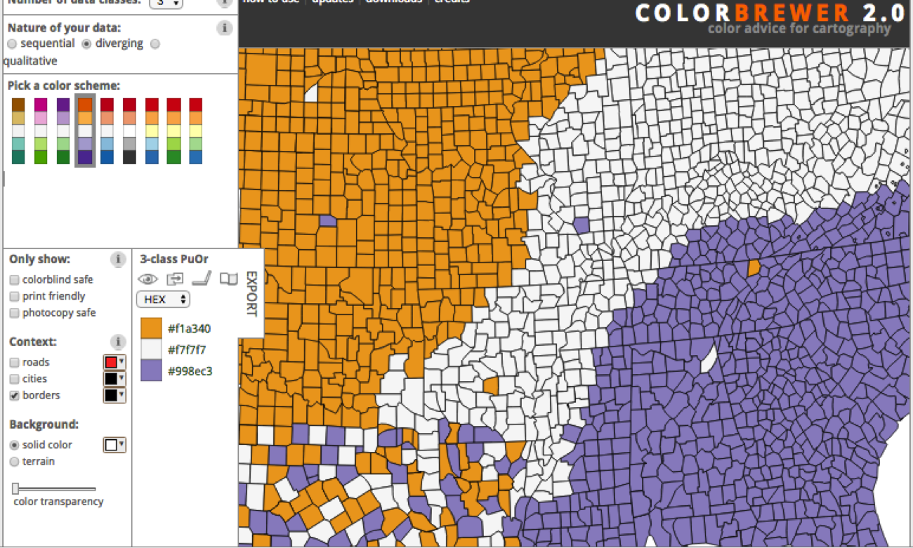
Diverging color schemes allow you to highlight the middle range/extremes of quantitative data by using two contrasting hues on the extremes and a lighter tinted mixture to highlight the middle range.
Qualitative color schemes are used to highlight — you guessed it — qualitative categories. With qualitative data, you typically want to create a lot of contrast, which means using different hues to represent each of your data points.
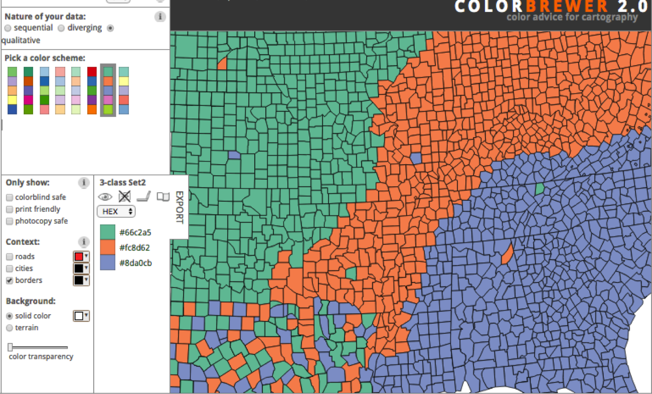
Note: The images above are from Color Brewer 2.0 — a data visualization color tool designed for working with data mapping. Check it out for your next data map visualization or for grabbing pre-made color schemes to use based on the sequential, diverging, and qualitative models.
How Many Unique Hues Do You Need to Use?
Now that you’ve determined which kind of display you want to use, it’s time to determine the number of hues you need to use.
Your hues are the unique colors (like red or blue) in their purest form (without any tinting or shading). Using unique hues is what creates contrast. In data visualization, creating contrast is highly important because it tells the viewer that the contrasting colors are comparative data points. Contrasting colors suggest that the data points are categorical, not correlated, showing you the difference between them rather than the relationship of progression.
Keep in mind that it’s possible to use both a sequential and qualitative color scheme in the same visualization. And if this is the case, you’ll need to build a scheme that uses both gradients and unique hues.
The Role of Brightness in Color Selection
One very important tip for creating and finding color schemes for you data visualizations concerns understanding and utilizing the brilliance of colors for a purpose.
In the two pie charts below, notice the brightness of the colors used. On the left pie chart, you can see that there are four main hues used and four tints of each hue. This might signify a relationship between the hue and the tints, or it may just be used to draw attention to some sections of the data over the others.
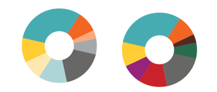
On the right pie chart, all of the eight hues used have the same brightness. None have more white or black added them to create a shade or a tint, which ultimately creates a balanced, contrasting aesthetic.
Shading and brightness is incredibly important to consider when creating data visualizations because it can be easy to skew the interpretation of your data by drawing attention to some data points over others.
For qualitative data, unless you’re trying to point out one specific data point’s significance, try to use equally bright hues with contrasting colors to display your data.
For sequential quantitative data, shading is important because you’re likely using a gradient. Gradients are made up of different shades and tints of a hue to show the progression of one hue from light to dark — much like the progression of the data from high to low.
What Tools Can You Use to Find the Perfect Color Combination?
When it comes to finding the perfect color scheme for your data visualizations, I highly recommend finding a scheme that’s already out there. This isn’t to say that you don’t need to have a strong grasp on basics of color selection, though — even existing color schemes will need to be customized to the data you’re using. In other words, it’s still important that you know your stuff.
Let’s check out a few tools that’ll help you get started …
1) Colorpicker for Data
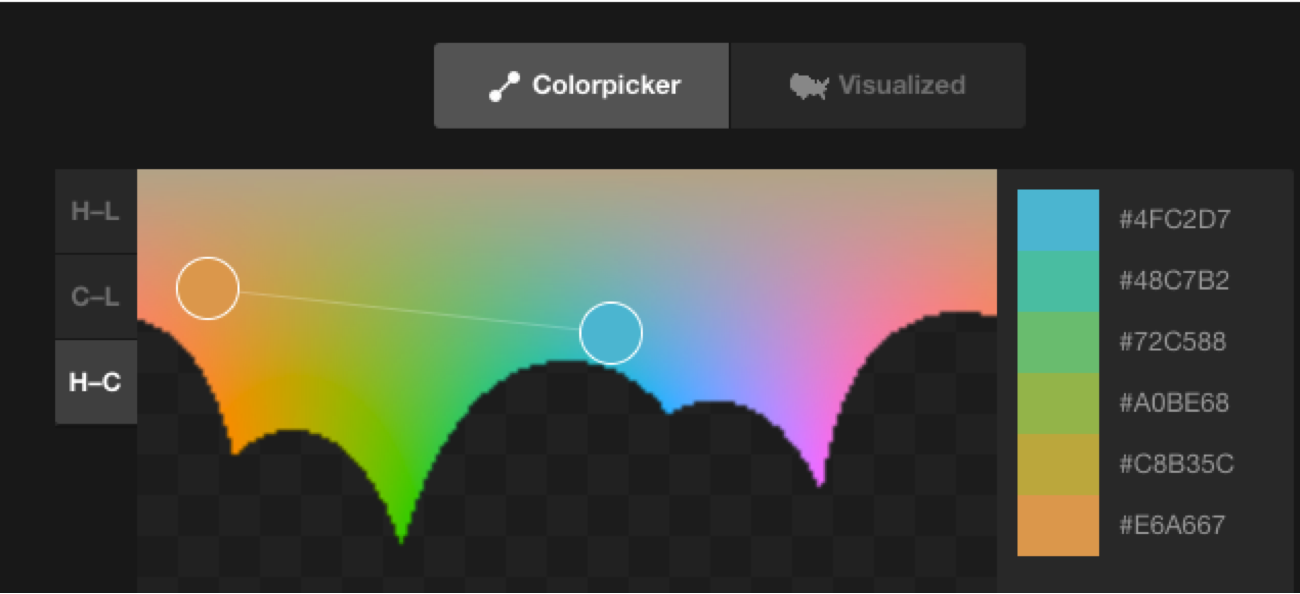
A fairly simple tool, Colorpicker let’s you hold one color in place while you drag the other locator around to find a multi-hued, gradient-based color scheme. Although this tool is limited in nature, I like that it gives you the option to visualize your color scheme on a map to show you what the scheme looks like in practice.
2) Color Hunt
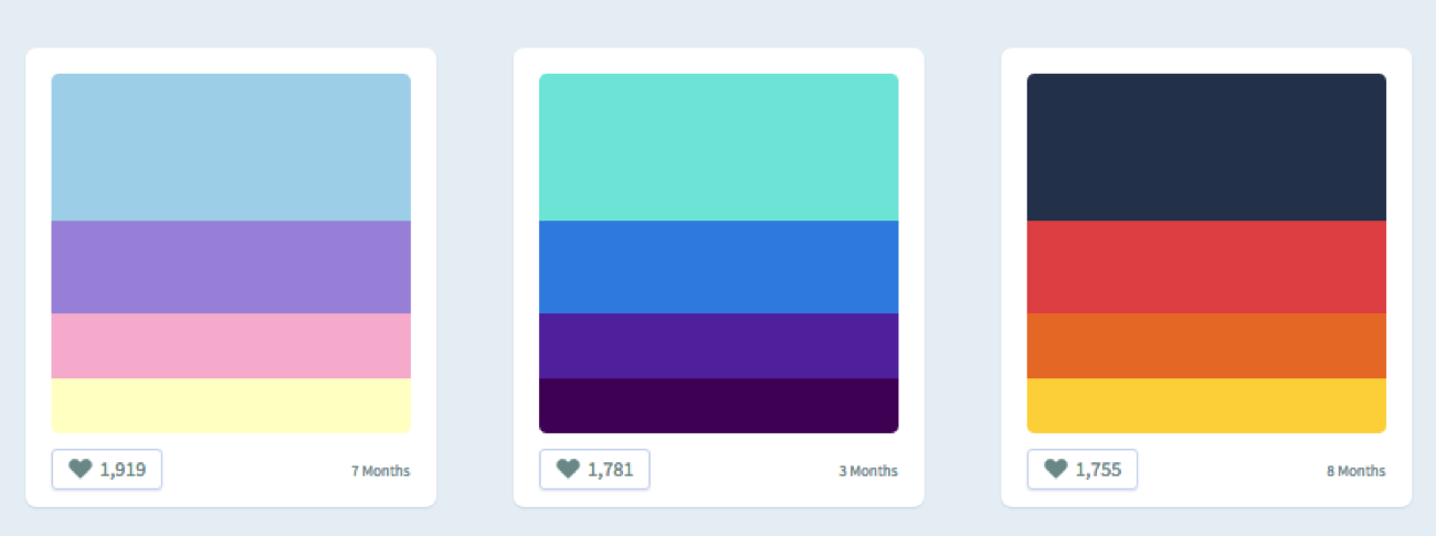
If you’re just looking for premade color schemes to browse through, Color Hunt is the tool for you. This website is devoted to just color schemes, allowing you to easily gain inspiration and uncover HEX codes.
A caveat, however, is that each of the schemes are limited to four colors. If you’re data visualization requires more hues than four, this may not be the tool for you.
3) Designspiration.net
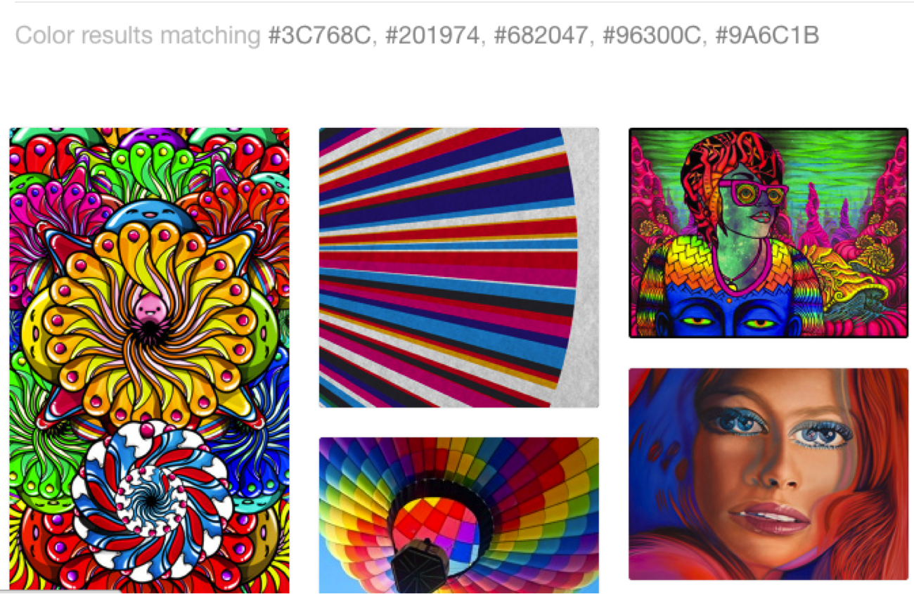
One of my personal favorite sites for design work, be it data visualization or otherwise, is Designspiration.net. Not only does Designspiration give you thousands of graphics to look through for inspiration, but it also allows you to sort through designs by color.
This is a great tool to use for your data visualization (even if the representations aren’t data-based) because it shows you what colors look like in contrast to one another. The color-sort tool also gives you the HEX codes ready to access, making it really easy to put together a combination that suits your needs.
4) FlatUIColorpicker.com
As a part of Designmodo’s Free User Interface toolkit, they created a tool to help you uncover colors to use in your design process. Although these colors aren’t necessarily part of premade schemes, they are really great for showing you bright, vibrant colors used for user interface design. You can easily browse through their color lists and create your own color schemes using the color picker.
5) Adobe Color CC
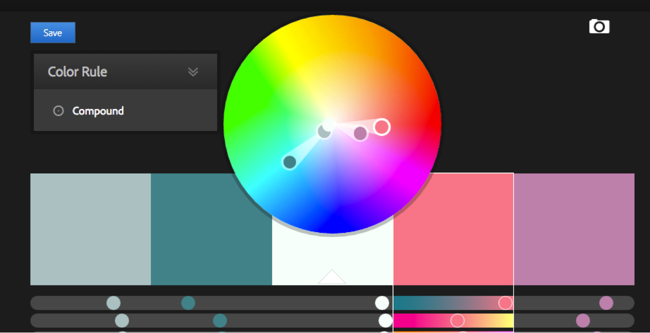
A classic tool for designers using Adobe products, Adobe Color CC allows you to create your own color schemes using the mathematical model-based color schemes (monochromatic, analogous, triadic, complementary, etc.). Adobe Color CC also has a great browser section you can use to find premade color schemes.
What If You Still Can’t Find What You Need?
What if you decide you’re really looking for a color scheme that isn’t already out there? What do you do?
Creating a color scheme for data visualizations from scratch can be especially difficult because the colors you use have to either show vast contrast or natural progressions.
A great way to find inspiration for these types of color schemes is to draw on your surroundings. This could be a colorful photo, a mural, a sunset, or anything in nature — you name it. If you look around to find color schemes that appeal to you in your physical surroundings, you can use this to create a color scheme for the virtual.
If you have a good eye, you may even be able to create a color scheme this way by trial and error. However, it’s more likely that you’ll need to use a tool like Adobe Capture CC or Chroma by Softpress to snap a picture and grab the colors from the picture to use in your designs.

When creating data visualizations, the most important part of choosing the right color scheme comes down to understanding your data.
With so many different tools and premade color schemes out there, the hardest part isn’t actually finding the right colors; it’s knowing how to use those colors to display the information in the best way possible.
Now that you know how to find your color schemes, go put your newfound knowledge to work.
How do you choose color schemes for your data visualizations? Share your tips below.
