At one point or another, we all need inspiration to do our jobs better. It doesn’t matter whether you’re a marketing veteran who has navigated through years of changing technology or a newbie fresh out of college — we all need examples of outstanding content. It helps us get through creative ruts, make the case to our boss for experimentation, and improve our own marketing.
Most of the time, inspiration is easy to find because most marketing content is publicly available. You can scour the internet or go on your favorite social network to see what your connections are talking about.
But there’s one marketing channel that is really, really hard to find good examples of unless you’re already in the know: email. There’s nothing casual about it — you usually need to be subscribed to an email list to find great examples of emails. And even if you’re subscribed to good emails, they are often bombarding you day after day, so it’s hard to notice the gems. 
Because it’s so difficult to find good email marketing examples, we decided to do the scouring and compiling for you. Read on to discover some great emails and get the lowdown on what makes them great — or just keep on scrolling to get a general feel for each. However you like to be inspired is fine by us!
15 Examples of Effective Email Marketing
1) charity: water
When people talk about email marketing, lots of them forget to mention transactional emails. These are the automated emails you get in your inbox after taking a certain action on a website. This could be anything from filling out a form to purchasing a product to updating you on the progress of your order. Often, these are plain text emails that email marketers set and forget.
Well, charity: water took an alternate route. Once someone donates to a charity: water projects, their money takes a long journey. Most charities don’t tell you about that journey at all — charity: water uses automated emails to show donors how their money is making an impact over time. With the project timeline and accompanying table, you don’t even really need to read the email — you know immediately where you are in the whole process so you can move on to other things in your inbox.

2) BuzzFeed
I already have a soft spot for BuzzFeed content (21 Puppies so Cute You Will Literally Gasp and Then Probably Cry, anyone?), but that isn’t the only reason I fell in love with its emails.
First of all, BuzzFeed has awesome subject lines and preview text. They are always short and punchy — which fits in perfectly with the rest of BuzzFeed’s content. I especially love how the preview text will accompany the subject line. For example, if the subject line is a question, the preview text is the answer. Or if the subject line is a command (like the one below), the preview text seems like the next logical thought right after it:

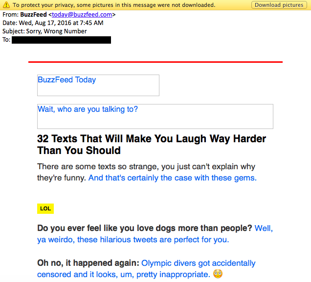
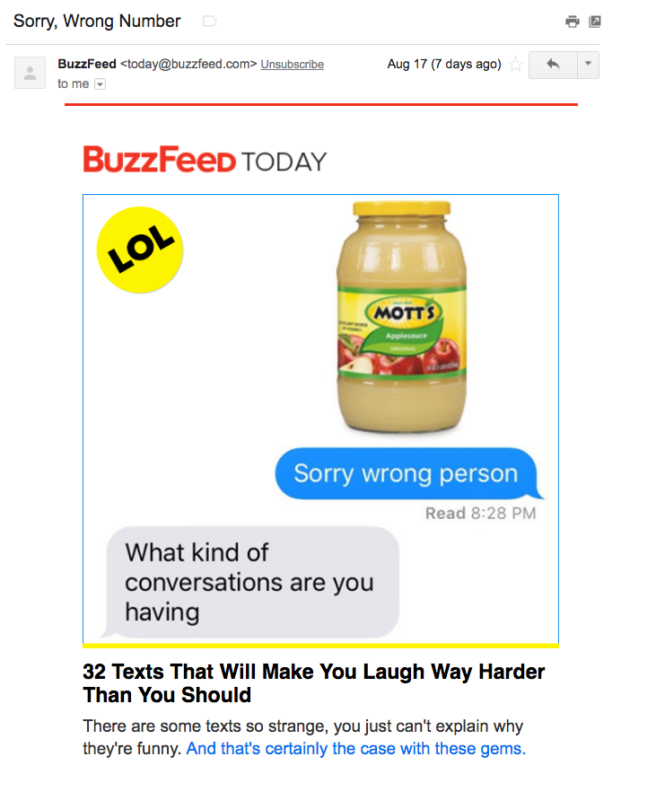
Once you open up an email from them, the copy is equally awesome. Just take a look at that glorious alt text action happening where the images should be. The email still conveys what it is supposed to convey — and looks great — whether you use an image or not. That’s definitely something to admire.
Without images:
With images:
3) Uber
The beauty of Uber‘s emails is in their simplicity. They let their email subscribers know about deals and promotions by sending an email like the one you see below. We love how brief the initial description is, paired with a very clear call-to-action — which is perfect for subscribers who are quickly skimming the email. For the people who want to learn more, these are followed by a more detailed (but still pleasingly simple), step-by-step explanation of how the deal works.
We also love how consistent the design of their emails is with their brand. Like their app, website, social media photos, and other parts of their visual brand, their emails are represented by bright colors and geometric patterns. All of their communications and marketing assets tell their brand’s story — and brand consistency is one tactic Uber’s nailed in order to gain brand loyalty.

4) TheSkimm
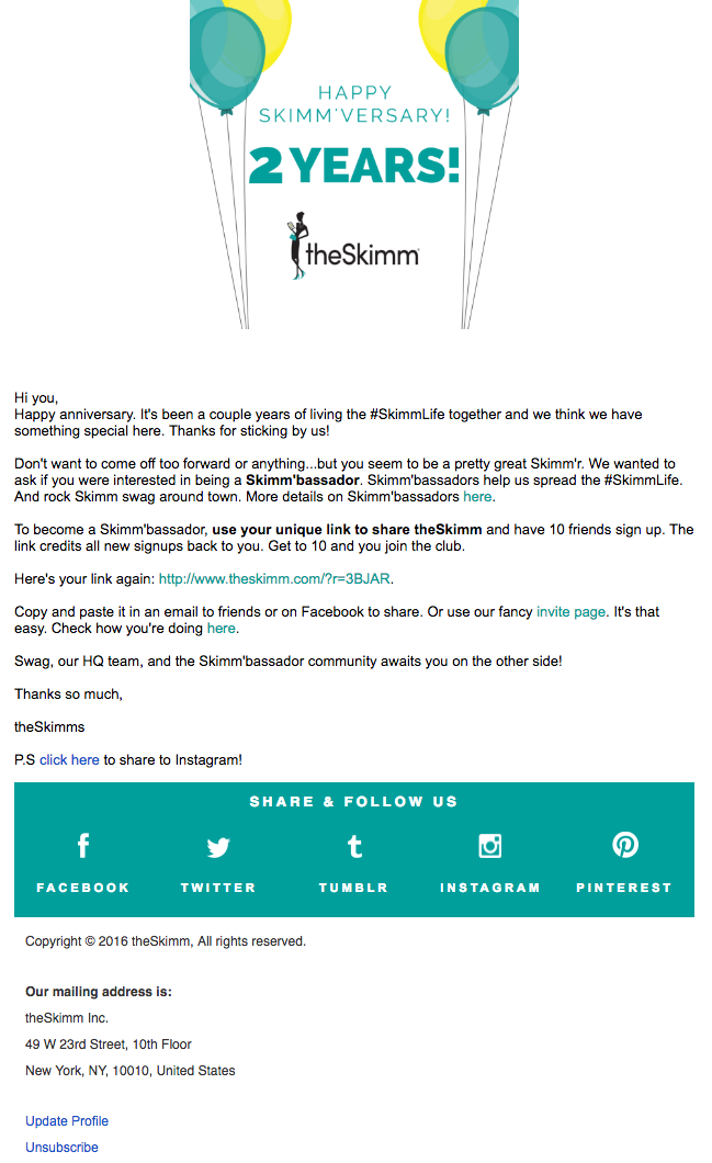
We’ve written about TheSkimm’s daily newsletter before — especially its clean design and its short, punchy paragraphs. But newsletters aren’t TheSkimm’s only strength when it comes to email. Check out their subscriber engagement email below, which rewarded my colleague Ginny Mineo for being subscribed for two years.
Emails triggered by milestones like anniversary emails and birthday emails are fun to get — who doesn’t like to celebrate a special occasion? The beauty of anniversary emails in particular is that they don’t require subscribers to input any extra data, and they can work for a variety of senders and the timeframe can be modified based on the business model.
Here, the folks at TheSkimm took it a step further by asking her if she’d like to earn the title of brand ambassador as a loyal subscriber — which would require her to share the link with ten friends, of course.
5) Mom and Dad Money
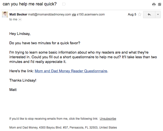
Think you know all about the people who are reading your marketing emails? How much of what you “know” about them is based on assumptions? The strongest buyer personas are based on insights you gather from your actual readership, through surveys, interviews, and so on, in addition to the market research. That’s exactly what Matt Becker of Mom and Dad Money does — and he does it very, very well.
Here’s an example of an email I got in my inbox a few weeks ago. Design-wise, it’s nothing special — but that’s the point. It reads just like an email from a friend or colleague asking for a quick favor.
Not only was this initial email great, but his response to my answers was even better: Within a few days of responding to the questionnaire, I received a long and detailed personal email from Matt thanking me for filling out the questionnaire and offering a ton of helpful advice and links to resources specifically catered to my answers. I was very impressed by his business acumen, communication skills, and obvious dedication to his readers.
6) Poncho
Some of the best emails out there pair super simple design with brief, clever copy. When it comes down to it, my daily emails from Poncho, which sends me customizable weather forecasts each morning, takes the cake. They’re colorful, use delightful images and GIFs, and very easy to scan. The copy is brief but clever — some great puns in there — and aligns perfectly with the brand. Check out the copy near the bottom asking to “hang out outside of email.” Hats off to Poncho for using design to better communicate its message.

7) Birchbox
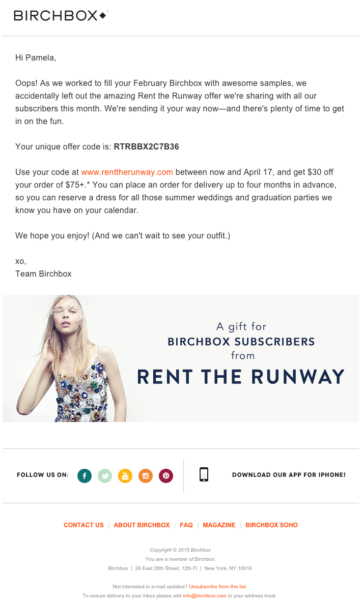
The subject line of this email from beauty product subscription service Birchbox got my colleague Pam Vaughan clicking. It read: “We Forgot Something in Your February Box!” Of course, if you read the email copy below, they didn’t actually forget to put that discount code in her box — but it was certainly a clever way to get her attention.
And the discount code for Rent the Runway, a dress rental company that likely fits the interest profile of most Birchbox customers, certainly didn’t disappoint. That’s a great co-marketing partnership right there.
8) Postmates
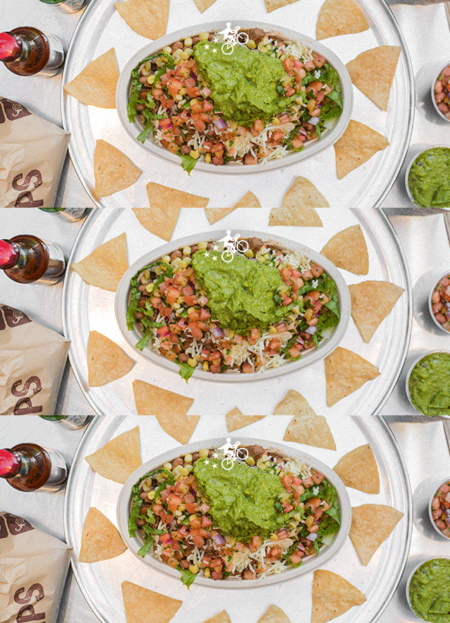
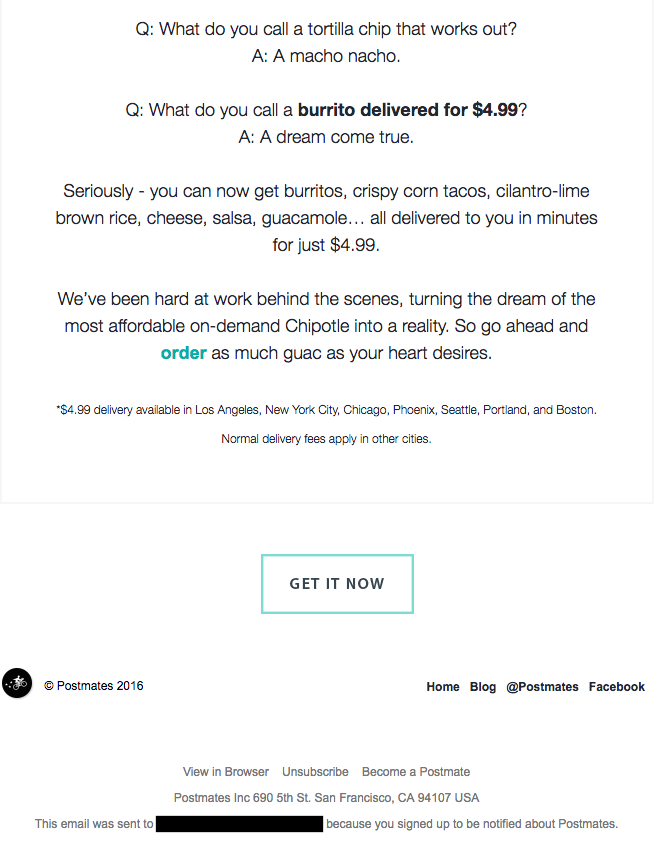
I’ve gotta say, I’m a sucker for GIFs. They’re easy to consume, they catch your eye, and they have an emotional impact — like the fun GIF in one of Postmates‘ emails that’s not only delightful to watch, but also makes you crave some delicious Chipotle.
You too can use animated GIFs in your marketing to show a fun header, to draw people’s eye to a certain part of the email, or to display your products and services in action. Here are the best places to find GIFs on the internet, and here’s an easy Photoshop tutorial for making your own.
9) Dropbox
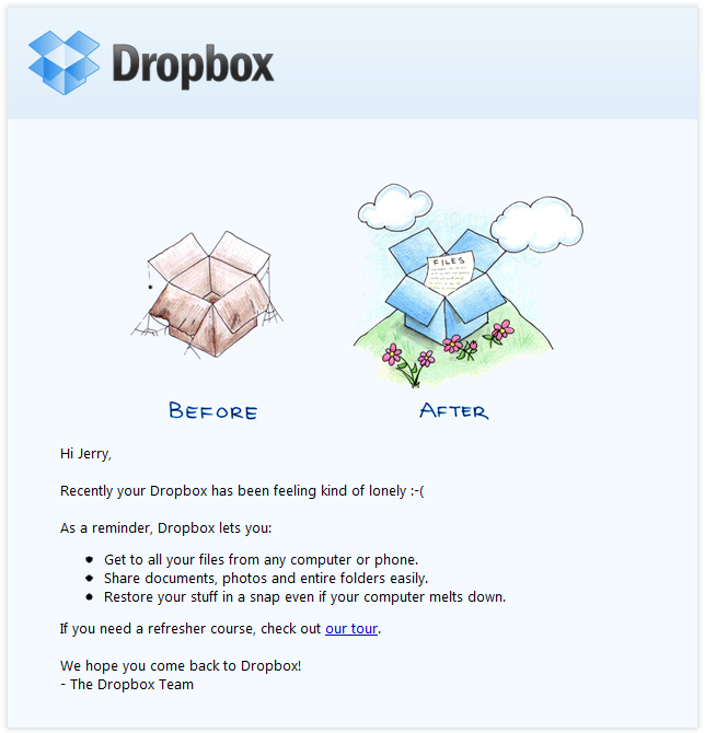
You might think it’d be hard to love an email from a company whose product you haven’t been using. But Dropbox found a way to make their “come back to us!” email cute and funny, thanks to a pair of whimsical cartoons and an emoticon.
Plus, they kept the email short and sweet to emphasize the message that they don’t want to intrude, they just want to remind the recipient that they exist and why they could be helpful. When sending these types of email, you might include an incentive for recipients to come back to using your service, like a limited-time coupon.
10) InVision App
Every week, the folks at InVision send a roundup of their best blog content, their favorite design links from the week, and a new opportunity to win a free t-shirt. (Seriously. They give away a new design every week.) They also sometimes have fun survey questions where they crowdsource for their blog. This week’s, for example, asked subscribers what they would do if the internet didn’t exist.
Not only is their newsletter a great mix of content, but I also love the nice balance between images and text, making it really easy to read and mobile-friendly — which is especially important because their newsletters are so long. (Below is just an excerpt, but you can read through the full email here.) We like the clever copy on their call-to-action buttons, too.

11) Warby Parker
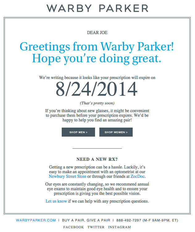
What goes better with a new prescription than a new pair of glasses? The folks at Warby Parker made that connection very clear in their email to a friend of mine back in 2014. It’s an older email, but it’s such a good example of personalized email marketing that I had to include it in here.
The subject line was: “Uh-oh, your prescription is expiring.” What a clever email trigger. And you’ve gotta love ’em for reminding you your prescription needs updating.
Speaking of which … check out the clever co-marketing at the bottom of the email: If you don’t know where to go to renew your subscription, the information for an optometrist is right in the email. Now there’s no excuse not to shop for new glasses!
12) Cook Smarts
I’ve been a huge fan of Cook Smarts‘ “Weekly Eats” newsletter for a while. The company sends yummy recipes in meal plan form to my inbox every week. But I didn’t just include it because of its delicious recipes … I’m truly a fan of its emails. I love the layout: Each email features three distinct sections (one for the menu, one for kitchen how-to’s, and one for the tips). This means you don’t have to go hunting to find the most interesting part of its blog posts — you know exactly where to look after an email or two.
I also love Cook Smarts’ “Forward to a Friend” call-to-action in the top-right of the email. Emails are super shareable on — you guessed it — email, so you should also think about reminding your subscribers to forward your emails to friends, coworkers, or heck, even family.

13) HireVue
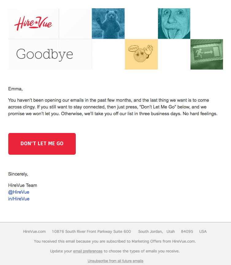
“Saying goodbye is never easy to do… So, we thought we’d give you a chance to rethink things”. That was the subject of this automated unsubscribe email from HireVue. We love the simple, guilt-free messaging here, from the funny header images to the great call-to-action button copy.
Not only are the design and copy here top-notch, but we applaud the folks at HireVue for sending automated unsubscribe emails in the first place. It’s smart to purge your subscriber lists of folks who aren’t opening your email lists because low open rates can seriously hurt email deliverability. We sent out a similar email in December 2015 when we automatically unsubscribed people once they became unengaged, which you can read about here.
14) Paperless Post
When you think of “holiday email marketing,” your mind might jump straight to Christmas, but there are other holidays sprinkled throughout the rest of the year that you can create campaigns around.
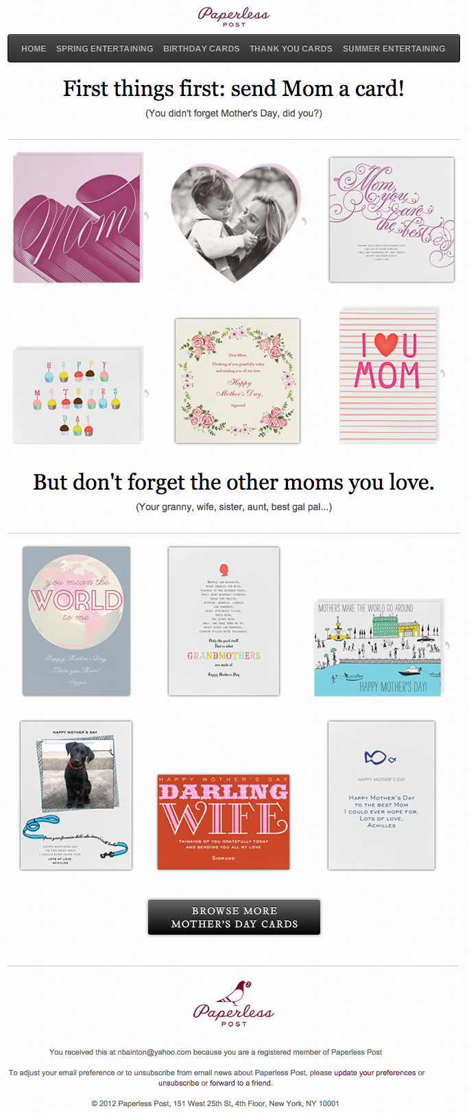
Take the email below from Paperless Post, for example. I love the header of this email: It provides a clear call-to-action that includes a sense of urgency. Then, the subheader asks a question that forces recipients to think to themselves, “Wait, when is Mother’s Day again? Did I buy Mom a card?” Below this copy, the simple grid design is both easy to scan and is quite visually appealing. Each card picture is a CTA in and of itself — click on any one of them and you will be taken to a purchase page.
15) Stitcher
Humans crave personalized experiences. It’s science. When emails appear to be created especially for you, you feel special — you’re not just getting what everyone else is getting. You might even feel like the company sending you the email knows you in some way, and that they care about your preferences and making you happy.
That’s why I love on-demand podcast/radio show app Stitcher‘s “Recommended For You” email. I tend to listen to episodes from the same podcast instead of branching out to new ones. But Stitcher wants me to discover (and subscribe to) all the other awesome content they have — and I probably wouldn’t without their encouragement.
I think this email is also quite a brilliant use of responsive design. The colors are bright, and it’s not too hard to scroll and click — notice the CTAs are large enough for me to hit with my thumbs. Also, the mobile email actually has features that make sense for recipients who are on their mobile device. Check out the CTA at the bottom of the email, for example: The “Open Stitcher Radio” button prompts the app to open on your phone.

These are just some of our favorite emails. Don’t just follow best practice when it comes to your marketing emails. Every email you send from your work email address also can be optimised to convert. Try out our free email signature generator now. Check out some more of our favorite HubSpot marketing email examples.
Editor’s note: This post was originally published in October 2013 and has since been updated for accuracy and comprehensiveness.
![]()
