When you’re an email marketer, your to-do list often looks like this: Generate opt-in leads, segment your lists, set up lead nurturing workflows, draft clear and concise email copy, check your emails for deliverability, optimize for plain text and HTML, and so on.
Geez … isn’t there any fun in email marketing anymore?
Thankfully, there are plenty of email marketing geeks out there (ourselves included) that do think all of that’s kind of fun. But these less glamorous aspects of email marketing — though critical to your campaign’s success — don’t paint the entire picture of what amazing email marketing really is.
Download our free ebook here to learn how to design emails that people actually click.
There are brands out there that have also figured out how to create emails that are pretty darn beautiful. While plain text or bare-bones emails can still be extremely effective, sometimes you want to amaze your subscribers with creative, captivating, or delightfully understated email design.
If you’re looking to dabble in something a little more adventurous for your next email marketing campaign, check out the examples below for inspiration.
Email Newsletter Design Examples
1) Collaborative Fund
In design, red and yellow serve as powerful color choices. While red is known to convey power or passion, yellow is often considered both bright and energizing.
Although many companies use a big block of color at the top of their newsletters to draw people in, the folks at Collaborative Fund took it a few steps further by combining red and yellow bursts of color throughout the whole email. Pretty powerful, right?
Color aside, they leveraged clean divides to separate these blocks, while incorporating different textures — like that crumpled paper — to create a really compelling experience.

Image Credit: Beautiful Email Newsletters
2) Starbucks
This newsletter from Starbucks covers a lot of information: instructions for the pour-over method, a call-to-action to shop for a new product, recipes for summer floats, and so on.
To make this more easily scannable, the folks at Starbucks paired these short descriptions with high quality images. (You can practically hear the coffee being poured over ice in the first image.) Like the Collaborative Fund example, they also used clear, horizontal divides to separate each topic.
In addition, we really like how they incorporated the Pinterest logo and the Instagram logo alongside two of the calls-to-action. These logos support the text by setting the recipient’s expectation up front. In other words, they know that clicking through to browse more recipes will ultimately direct them to Pinterest.

Image Credit: Beans N’ Rice
3) InVision LABS
Here’s a much more concise email from InVision, which includes a clean design and an eye-catching color. Thanks to that darker blue background, both the call-to-action and the white box near the bottom of the email really command attention.
Additionally, the fanned out product images help the recipient understand what the announcement entails before diving into the explainer copy.

Image Credit: Really Good Emails
The best part? The colorful experience doesn’t stop with the email. The bright blue color is carried through to the corresponding website, making this a strong example of seamless branding.
4) GrubHub
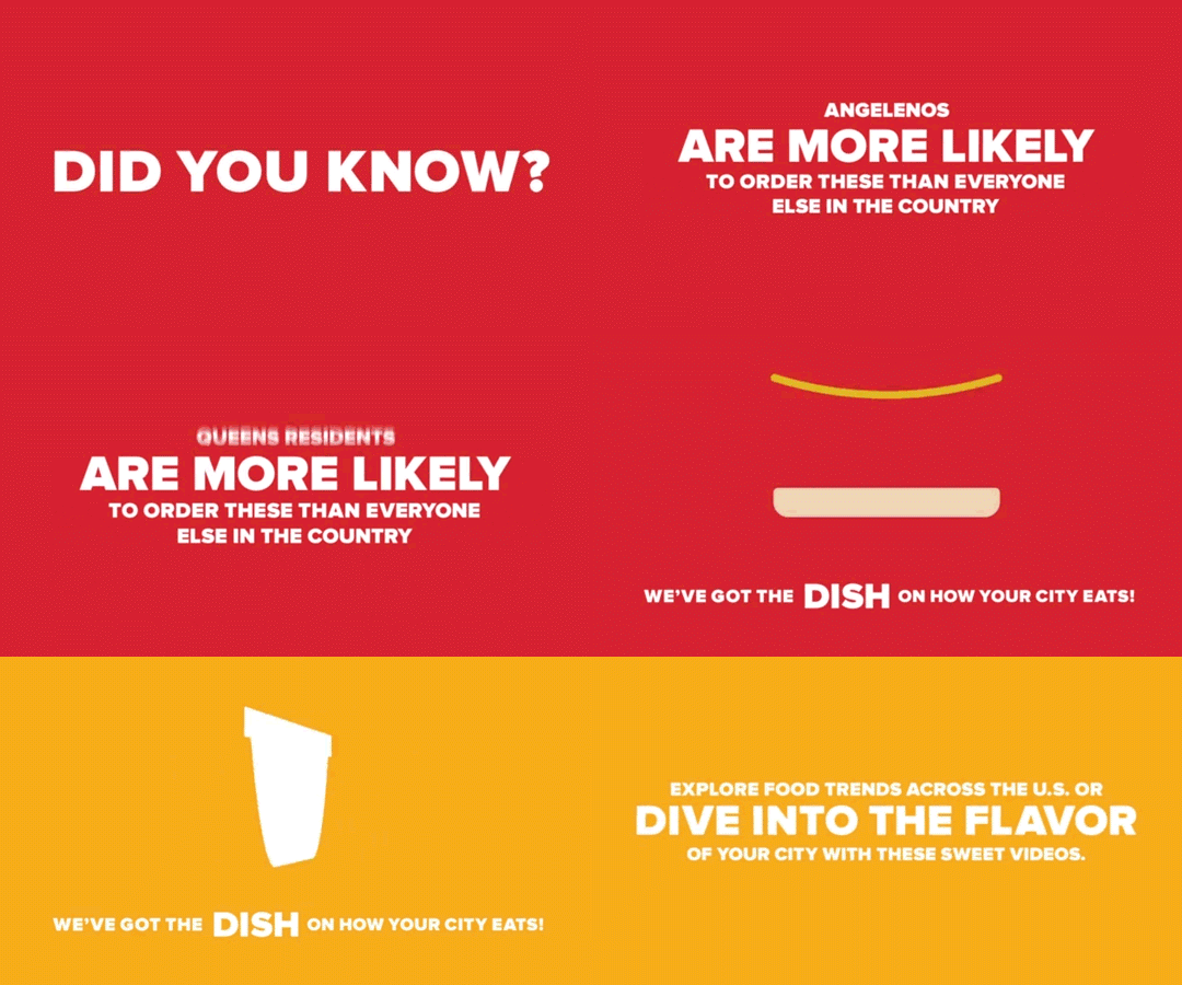
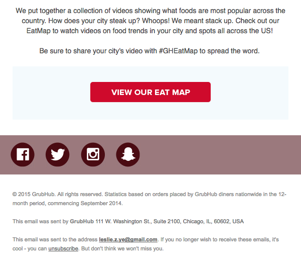
This email from GrubHub is a great example of product promotion … because it doesn’t sound or feel like product promotion at all. Instead of saying, “Hey, you like food. You should order it using our service!”, the email tells a story with the help of a really cool piece of interactive content: an “Eat Map.” (See what they did there?)
We especially love the colorful GIF they used to promote the piece of content, as it really commands the recipient’s attention. (Want to learn how to create a GIF using Photoshop? Read this.)

Nurturing Email Design Examples
5) Handy
We love this simple welcome email from Handy. The color scheme is consistent, relying on grey for the base, and bright blue to draw attention to the logo and calls-to-action.
There’s a nice balance between text and visuals here, and the tile design makes it easy to skim through. Finally, we love that they used non-cheesy stock photos to represent their brand, which makes them more genuine and lovable from a consumer perspective.
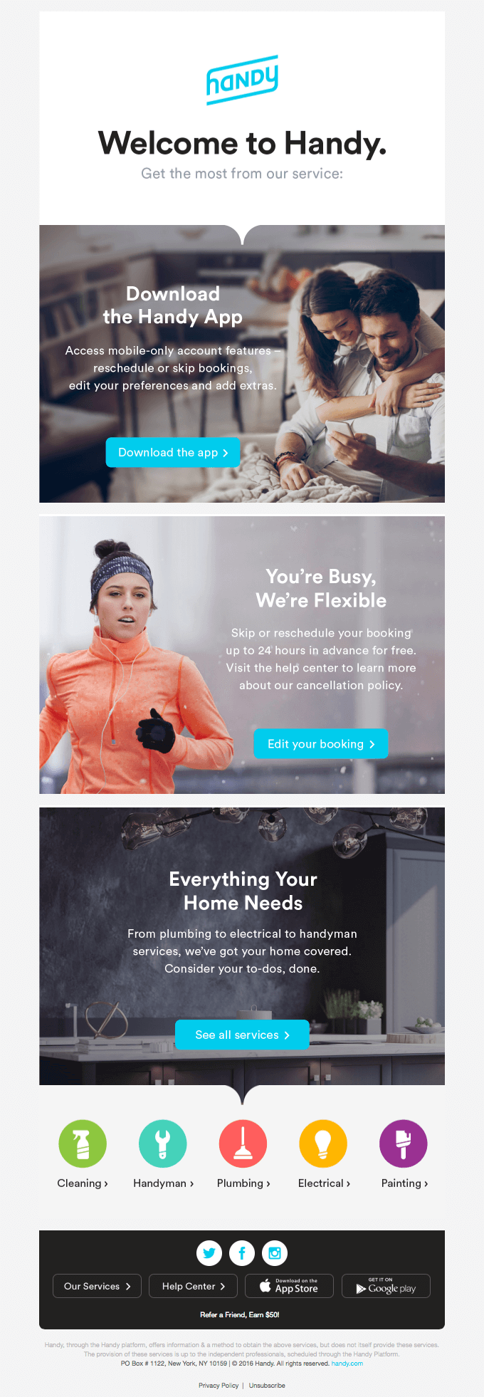
Image Credit: Really Good Emails
6) Litmus
You might expect a beautiful email from a company that’s announcing an email design conference — and Litmus doesn’t disappoint. The email starts out with a bold burst of color, which grabs readers’ attention. Below this, you’ll find a clean design that includes concise copy, whimsical illustrations, and a great use of white space.
At the bottom of the email, you’ll see a live Twitter feed showing tweets that use the conference’s official hashtag. That social engagement factor is a really cool touch that we’re willing to bet increased engagement, while simultaneously informing folks about how to stay connected at the event.

Image Credit: Really Good Emails
7) Uber
As marketers, we know that charts and graphs can serve as an effective way to illustrate information. But what about incorporating graphs into emails?
This email design from Uber skillfully demonstrates the power of data visualization through the use of simple graphs. Rather than relying on words to explain their lowered rates, Uber whipped up a few comparative visuals to do the job. Thanks to the bright blue color choice, it’s easy for recipients to understand how the rates have shifted in just a quick glance.
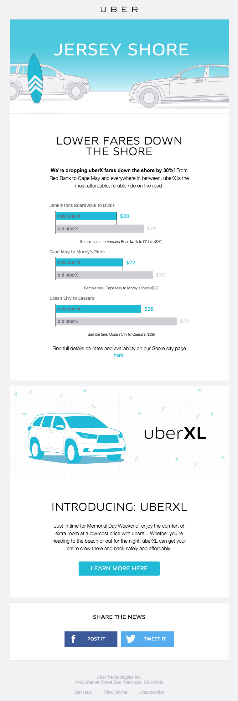
Image Credit: HTML Email Gallery
8) Cuyana
Here’s a product promotion email Cuyana sent to people who signed up for a new product’s “early access” list. The email is centered entirely around showcasing the new product, but in this case, that’s exactly what the folks who opted in to the “early access” list were looking for.
The design of the email is clean and sophisticated, thanks to a brilliant use of negative space and attractive fonts. This approach is very true-to-brand for a women’s apparel and accessories company. We love the use of consistent coloring — especially the signature orange hue they chose for the call-to-action button at the bottom.
(Note: This is an example of an email made using HubSpot. Click here to check out more email marketing examples from our library.)
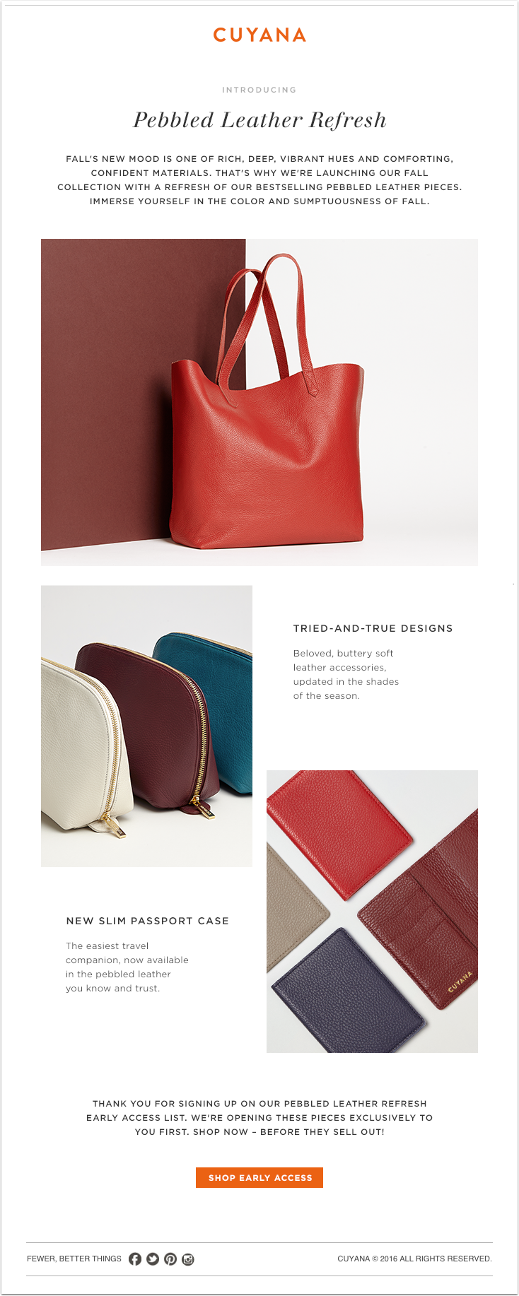
Image Credit: HubSpot Academy
Ecommerce Email Design Examples
9) J.Crew
Sometimes, words can be overrated. Why not let a picture tell the story for you? That’s what J.Crew did in this email, anyway. The email is promoting a sale, but you wouldn’t know it right away: All you see is the copy, “This is worth the scroll,” along with a very long (and very scroll-worthy), high-definition picture of an ice cream cone. Yum.
If you make it to the bottom, you’ll notice that the tip of the ice cream cone acts like a directional arrow, pointing recipients toward the call-to-action.

Image Credit: Akingkiwi
10) Apple
This holiday email from Apple balances white space with product displays to create a really interesting experience.
While the products all share a similar color scheme, what’s really compelling is their positioning. By strategically arranging the products, Apple was able to create visual patterns that alternate throughout the email.
Image Credit: HTML Email Gallery
11) Union Made Goods
Consumers get a lot of emails from ecommerce businesses showcasing holiday gift ideas from their websites, and this is an example of one of these emails done well. They opted for a simple design here, which includes a really nice use of both color and white space, making the copy and images that are there pop a little more.

Image Credit: Canva
12) Shwood & Stanley
In the ecommerce world, the quality of visuals in your emails can have a huge impact on whether recipients stick around to look through the whole email, or quickly hit the “delete” button. This email from Shwood & Stanley places a big emphasis on those high-quality visuals. We especially love the textured backgrounds, as well as the ways in which they play with list and shadows.

Image Credit: Really Good Emails
13) Harry’s
For seasonal emails like this one from Harry’s, you might consider using color schemes that go with the season. To promote their winter gift set, the folks at Harry’s cooled down their color scheme with traditional winter colors like green, blue, and brown. They also struck a nice balance between text and visuals, and helped to make their email easier to skim by using a simple tile design.
Not to mention, those bright red calls-to-action look pretty clickable … wouldn’t you agree?
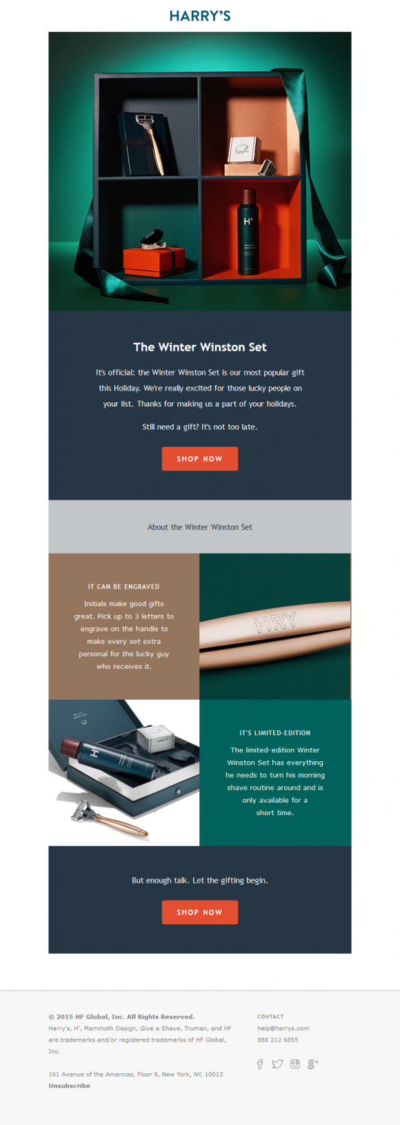
Image Credit: Beautiful Email Newsletters
What other companies out there have you noticed are creating beautiful email marketing?
Editor’s Note: This post was originally published in May 2012 and has been updated and for freshness, accuracy, and comprehensiveness.
![]()

